Know how your
workflows actually perform
Total executions, success and failure rates, average time per workflow, top workflows, and error trends. Spot bottlenecks early.

From idea to shipped integration in 4 steps
Register your app for a clean workspace, define triggers and actions, set up auth, and publish for one click install.
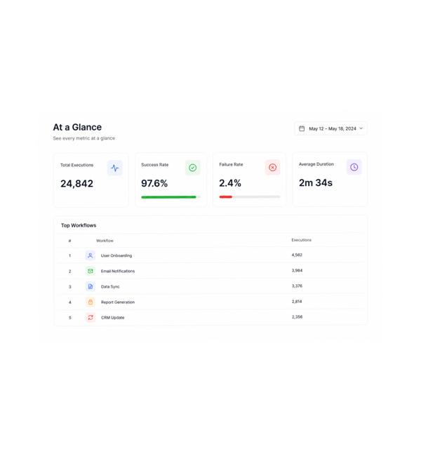
At a Glance
See every metric at a glance
The dashboard opens with the metrics every team needs first: total executions, success and failure rate, average execution time per workflow, and a ranked list of the most used workflows. Numbers refresh as runs complete.
- Total Executions
- Success Rate
- Average Duration
- Top Workflows
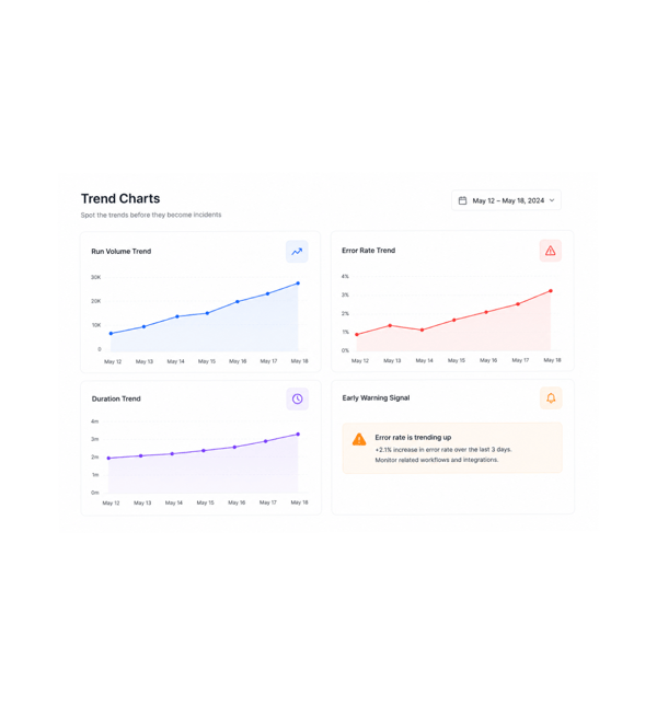
Trend Charts
Spot the trends before they become incidents
Trend charts show how every metric moves: run volume rising, error rates ticking up before a service breaks, duration creeping higher as a workflow grows. Patterns that surfaced only after a complaint now show first.
- Run Volume Trend
- Error Rate Trend
- Duration Trend
- Early Warning Signal
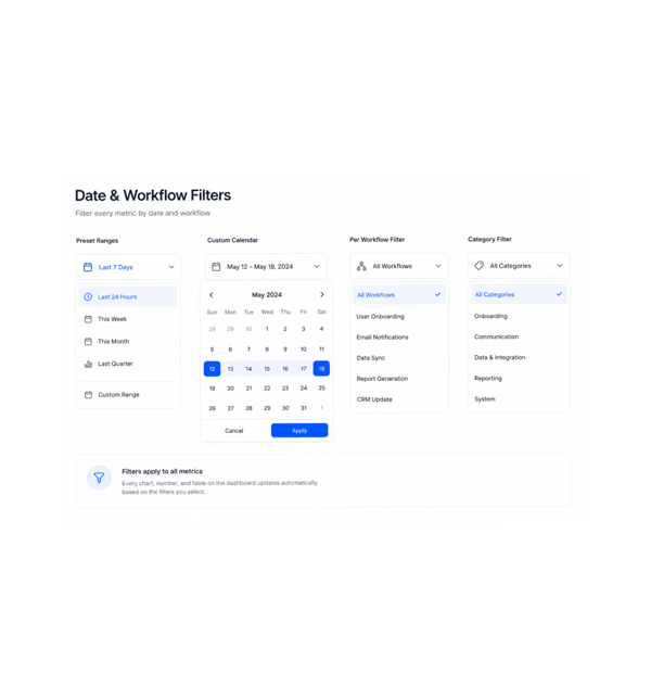
Date & Workflow Filters
Filter every metric by date and workflow
Slice the view to exactly what matters with date range and workflow filters that apply across every chart. Last 24 hours, this week, this month, last quarter, or a custom range: pick once and every metric updates.
- Preset Ranges
- Custom Calendar
- Per Workflow Filter
- Category Filter
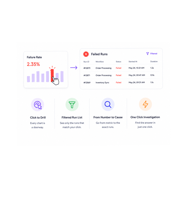
Drill Into Runs
Drill into the runs behind the numbers
Every chart is a doorway. Click the failure rate bar and the history opens filtered to failed runs. Click the slow workflow and the longest runs appear in order. The dashboard does not just show what happened, it takes you there.
- Click to Drill
- Filtered Run List
- From Number to Cause
- One Click Investigation
Six reasons teams never go back
Once a team has one dashboard with every metric, trend, filter, and drill down, stitching reports by hand stops.

Volume, success, and speed in one view
Total executions, success and failure rates, and average time share one dashboard, date range, and filters. How every automation performs is one screen, not three reports.

Trends surface problems before incidents
The error rate creeping up for three days shows in the trend chart before it becomes an incident. Duration growing weekly appears before it bites.

The slow workflows have nowhere to hide
Average time per workflow ranks every automation by duration, so the one that quietly grew from twenty seconds to three minutes is instantly visible.

The most used workflows get the attention they deserve
The most used ranking shows which automations do the heaviest lifting. A one second cut on a workflow running ten thousand times a day saves the most.

Error patterns become obvious
The error trend chart shows when errors happen, which workflows they hit, and which kinds recur. The Tuesday spike in one type becomes a clear pattern.

Date range filters slice every metric
Pick a date range once and every metric slices to it: executions, success rates, durations, top workflows, errors. Comparing months is one change.
Volume, success, and speed in one view
Total executions, success and failure rates, and average time share one dashboard, date range, and filters. How every automation performs is one screen, not three reports.
Trends surface problems before incidents
The error rate creeping up for three days shows in the trend chart before it becomes an incident. Duration growing weekly appears before it bites.
The slow workflows have nowhere to hide
Average time per workflow ranks every automation by duration, so the one that quietly grew from twenty seconds to three minutes is instantly visible.
The most used workflows get the attention they deserve
The most used ranking shows which automations do the heaviest lifting. A one second cut on a workflow running ten thousand times a day saves the most.
Error patterns become obvious
The error trend chart shows when errors happen, which workflows they hit, and which kinds recur. The Tuesday spike in one type becomes a clear pattern.
Date range filters slice every metric
Pick a date range once and every metric slices to it: executions, success rates, durations, top workflows, errors. Comparing months is one change.


13400+
Teams optimising automation
with the analytics dashboard
Built for teams who optimise what they measure
Operations leaders, platform teams, automation engineers, customer success, finance, and founders all use the Revo Analytics Dashboard as the single source of truth for how every automation performs.
Metrics
Charts
Filters
Insights
Totals, rates, durations, rankings
The dashboard opens with every metric the team needs: total executions, success and failure rate, average execution time per workflow, and a ranked list of the most used workflows. Numbers stay fresh as runs complete.
Everything the analytics dashboard ships with
A complete analytics toolkit in the platform. Total executions, success rates, average duration, top workflows, error trends.

Total Executions and Run Volume
The total execution count for the selected window, broken down by workflow, trigger type, and status. See how much automation work the platform is doing.

Success and Failure Rate Breakdown
The overall success rate of every workflow, broken down by workflow, error category, and trigger source. The health number sits beside what explains it.

Average Execution Time Per Workflow
Every workflow shows its average duration, ranked slowest to fastest. The one that grew from 20 seconds to 3 minutes tops the list.

Most Used Workflows Ranking
The most used workflows ranked by execution count, with success rate and average duration alongside. The heaviest lifting is visible at a glance.

Error Trends Over Time
The error rate over time as a trend chart, broken down by error category and workflow. The Tuesday morning spike becomes a visible pattern.

Date Range Filtered Charts
Every chart respects the date range filter. Last 24 hours, this week, month, quarter, or a custom range pick once and every metric updates together.
Everything you need to know
Common questions on the default dashboard, trend calculations, date ranges, and drill down.
Describe the workflow, Revo builds it across 1,000+ apps.
Write an automation in plain English and Revo connects your tools, then sends AI agents to take action while you sleep.
- 1,000+
- app integrations
- 99.9%
- workflow uptime
- 0
- lines of code to build
- 10x
- faster than manual