Analytics Dashboards with Real Time
Project Performance Insights
17 widget types across 4 dashboard roles. Workload reports, 8 risk alert types, sprint burndowns, velocity, and productivity.
From raw workspace data to a live intelligence dashboard in four steps
TARO aggregates task, sprint, workload, and risk data, then surfaces it in the right dashboard per role.
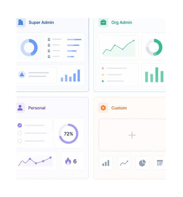
Roles
The right dashboard for every role in the workspace.
Not every role needs the same data. TARO provides four dashboard contexts, each pre-populated with the widgets most relevant to that role. Every dashboard is customisable across 17 widget types.
Widgets
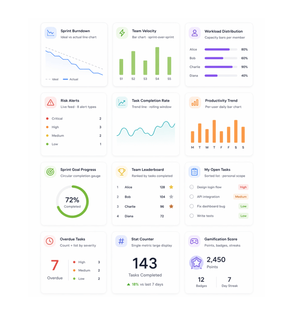
Seventeen widgets. Every delivery metric your team tracks.
Each widget draws from live TARO data: no manual entry, no CSV import, no third-party BI tool. Every widget updates automatically as tasks, sprints, and workloads change. Pick your widgets; the data stays current.
Alerts
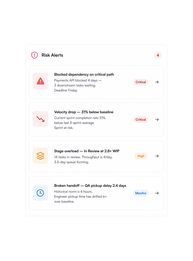
Eight alert types. Every risk pattern your sprint can produce.
The Risk Alerts widget monitors eight distinct risk signals at once, each a delivery failure mode. Alerts are severity-classified, named with the exact task or person, and carry a recommended action.
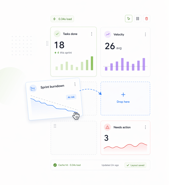
Build & Load
Drag any widget anywhere. Dashboard loads in under a second.
Every layout is customisable by drag and drop: move widgets anywhere, resize them, remove ones you don't need, add new ones. Layouts save per user. Data is cached on every state change, so the view loads in under a second.
Six reasons teams never go back
An 8-second dashboard gets checked once a day. One that loads in 0.3 seconds gets checked before every standup and shortens it.

Sub second load on every dashboard open
Dashboard data is cached on every workspace state change, not fetched fresh on open. One loading in 0.3 seconds gets used often; an 8-second one gets skipped.

8 alert types mean every risk pattern is named
Blocked dependencies, velocity drops, single points of failure, stage overloads, stalled workflows, broken handoffs, overdue cascades, and prediction slips.

Role specific defaults relevant from the first open
A Super Admin sees org-wide data, a developer their tasks and productivity, an Org Admin workload and risk alerts. The right data per role, no setup.

17 widget types cover every delivery metric
Sprint burndown, velocity, workload, risk alerts, completion rate, productivity, leaderboard, overdue tasks, epic progress, bottlenecks, and more, one source.

Drag drop layout means every dashboard is yours
Move widgets, resize them, remove the ones you don't need. Saved per user, with no shared layout everyone lives with. The lead's view differs from the PM's.

Per user productivity trends surface patterns silently
Daily task completion bars per member over the rolling window show who's accelerating, who's stalling, and whether a stall began before or after an event.
Sub second load on every dashboard open
Dashboard data is cached on every workspace state change, not fetched fresh on open. One loading in 0.3 seconds gets used often; an 8-second one gets skipped.
8 alert types mean every risk pattern is named
Blocked dependencies, velocity drops, single points of failure, stage overloads, stalled workflows, broken handoffs, overdue cascades, and prediction slips.
Role specific defaults relevant from the first open
A Super Admin sees org-wide data, a developer their tasks and productivity, an Org Admin workload and risk alerts. The right data per role, no setup.
17 widget types cover every delivery metric
Sprint burndown, velocity, workload, risk alerts, completion rate, productivity, leaderboard, overdue tasks, epic progress, bottlenecks, and more, one source.
Drag drop layout means every dashboard is yours
Move widgets, resize them, remove the ones you don't need. Saved per user, with no shared layout everyone lives with. The lead's view differs from the PM's.
Per user productivity trends surface patterns silently
Daily task completion bars per member over the rolling window show who's accelerating, who's stalling, and whether a stall began before or after an event.


800+
product teams already using TARO
Built for every role that needs
delivery data without asking for it
Org admins running cross team delivery and individual contributors tracking their own sprint progress both need dashboards just very different ones. TARO gives each the right view from the start.
Widget types
Risk alert types
Dashboard role contexts
Dashboard load time
The weekly delivery review starts from the Org Admin dashboard not a slide rebuilt every Friday.
Org admins open the Org Admin dashboard to start each delivery review: workload across all members, velocity for the last five sprints, active risk alerts, burndown, all on one screen.
Dashboards show the picture. These features explain it.
When a widget surfaces a risk or velocity drop, TARO's intelligence gives you the exact action to fix it.

Risk Prediction
The intelligence behind the Risk Alerts widget, scanning overdue tasks, stalled workflows, velocity drops, and blocked dependencies.

Workload Distribution
Intelligence behind the Workload Distribution widget, suggesting task reassignments to rebalance overloaded members in one click.

Completion Analysis
The intelligence behind the Sprint Burndown and Velocity widgets, predicting finish date, variance, and confidence from real sprint history.

Bottleneck Analysis
The intelligence behind the Bottleneck Summary widget diagnosing stage overloads, SPOFs, and broken handoffs with prescribed fixes and resolution tracking.
Everything you need to know about Analytics & Dashboards
Common questions from org admins, engineering leads, and team members evaluating TARO's dashboard system.
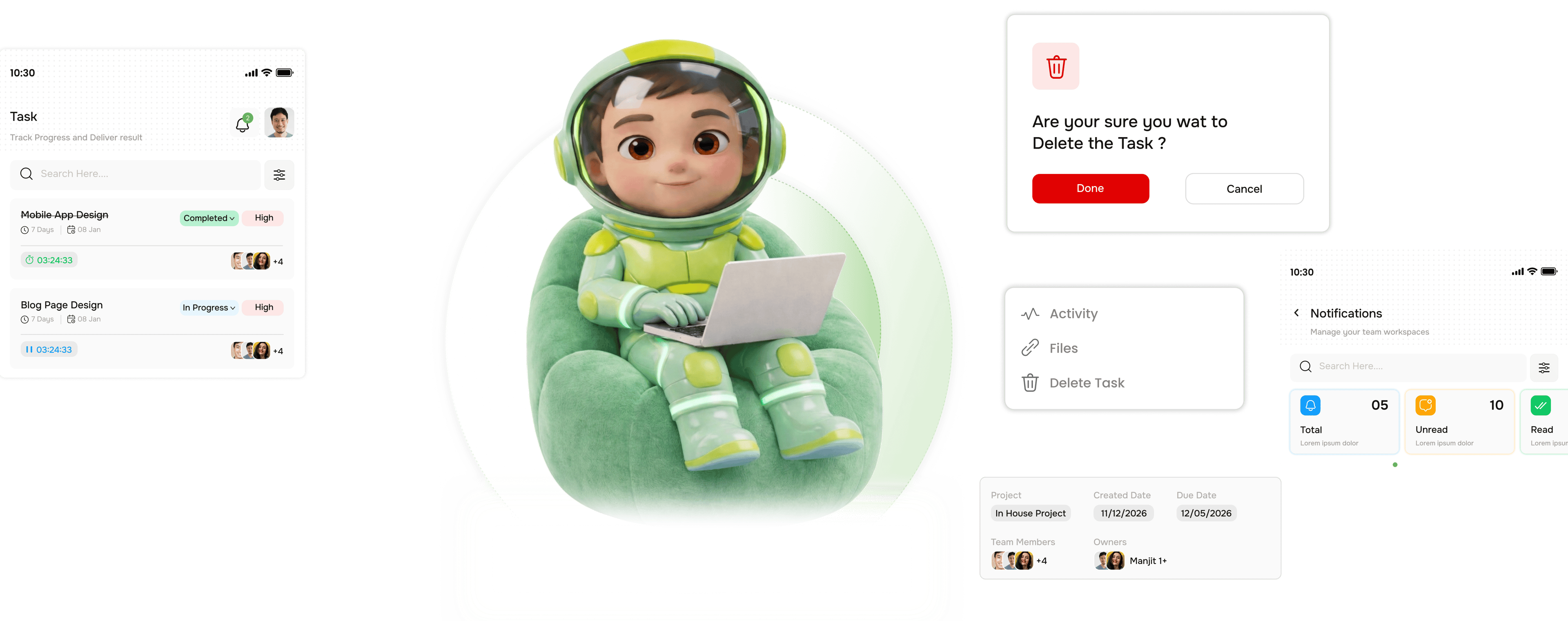
Taro plans, tracks, and flags risks before they hit.
Keep every project on track with AI that spots slippage early and tells your team what to do next.
- 87%
- on-time delivery
- 2.4x
- team throughput
- 0
- deadlines missed
- 35%
- fewer status meetings